Prototyping alpha
MVP 0.1: Extract and review
Design challenge - stay lean
After designing Extract’s initial user flows we had lots of ideas for features, and excitement for building AI tools that had never been done in government before. In lean-UX style, we removed every feature that came with a bucket-load of assumptions so we could get something out quickly, test, iterate and test again.
This resulted in a flow that looked like:
- Select your document type (TPO, Conservation area or Article 4)
- Upload your document
- A loading screen whilst the extraction is in progress
- Review the data on a map and through a text output
- Download or reject the extraction
The simplicity is on purpose, as we needed to understand what our users need and we needed to develop it quick! Adding multiple features to meet the same goal (e.g lots of ways to edit an extraction) could also create a paradox of choice for users and we’d miss out on understanding what they want to edit and how.
Fig 1. A template journey of MVP 0.1
Test
In this first round of usability testing, amongst other things, we wanted to understand:
- What does an accuracy mean to a user?
- Does accuracy mean the same thing to all users?
- Is the current extraction accurate-enough? And if the answer is no, what do users need to make it usable?
From the research sessions, we got lots of insights into users’ current process, and feedback on the prototype. We can now pair that with design for the next rapid iteration.
MVP 0.2 – Extract, edit and review
Insights from our first iteration told us a few things
- The biggest benefit to user was geo-referencing their image. Doing this manually takes a lot of time (some users took around 45 minutes to do this in GIS software), whereas Extract could do it for users in seconds.
- The Extract service can do a lot more through content to tell a user what the service is doing and what is expected of users.
- Users need support when comparing their original document with the extraction.
- Users want to edit, and the definition of accuracy varied across users.
In the Extract team we are working very fast – with the 2nd iteration of research planned a week after receiving insights. So, in the spirit of MVPs, the next iterations’ scope is everything from 0.1 with the addition of editing, and improved content.
Design challenge - combining two front-ends
During our first round of testing, i.AI and MHCLG’s front-end development diverged. This meant two separate ways of displaying the Extract service, each with different feature sets. MHCLG’s was super-lean whereas i.AI had a wealth of features on standby.
After our weekly collaboration time, we planned to unify both front ends and feature flag (turn off and on) the tools we wanted for testing. This sounded a lot simpler than it was, but if we unified, our development time could speed up – and we could get accessible editing tools in quicker.
During collaborative sessions, we figured out how we could combine the user flows into one – throwing away anything we didn’t need. This had to be done at a high level first (user-flows) so each team was clear on the scope.
Anything that we were adding in needed to have clear design rationale. The sessions were long and complicated, but gave us a shared vision of design for the next stage.
Fig 2.The first step to combine front-ends: combining user-flows
We then moved on to creating a ‘Frankenstein’ designs by mix-and-matching screenshots of each journey. By the end of these collaborative sessions, we ended up with was well-considered service. The discussion brought much more design crit and collaboration between dev and design across MHCLG and i.AI.
Key changes
In MVP 0.2 a user will view all the extractions in a task list, so the reviewing and editing process follows a clear pattern.
We think this will be particularly useful for TPO’s when there could be multiple trees and tree zones to review. It also reminds users that it is their responsibilty to review any data extracted by AI.
Fig 3. Tasklist following a users’ extractions
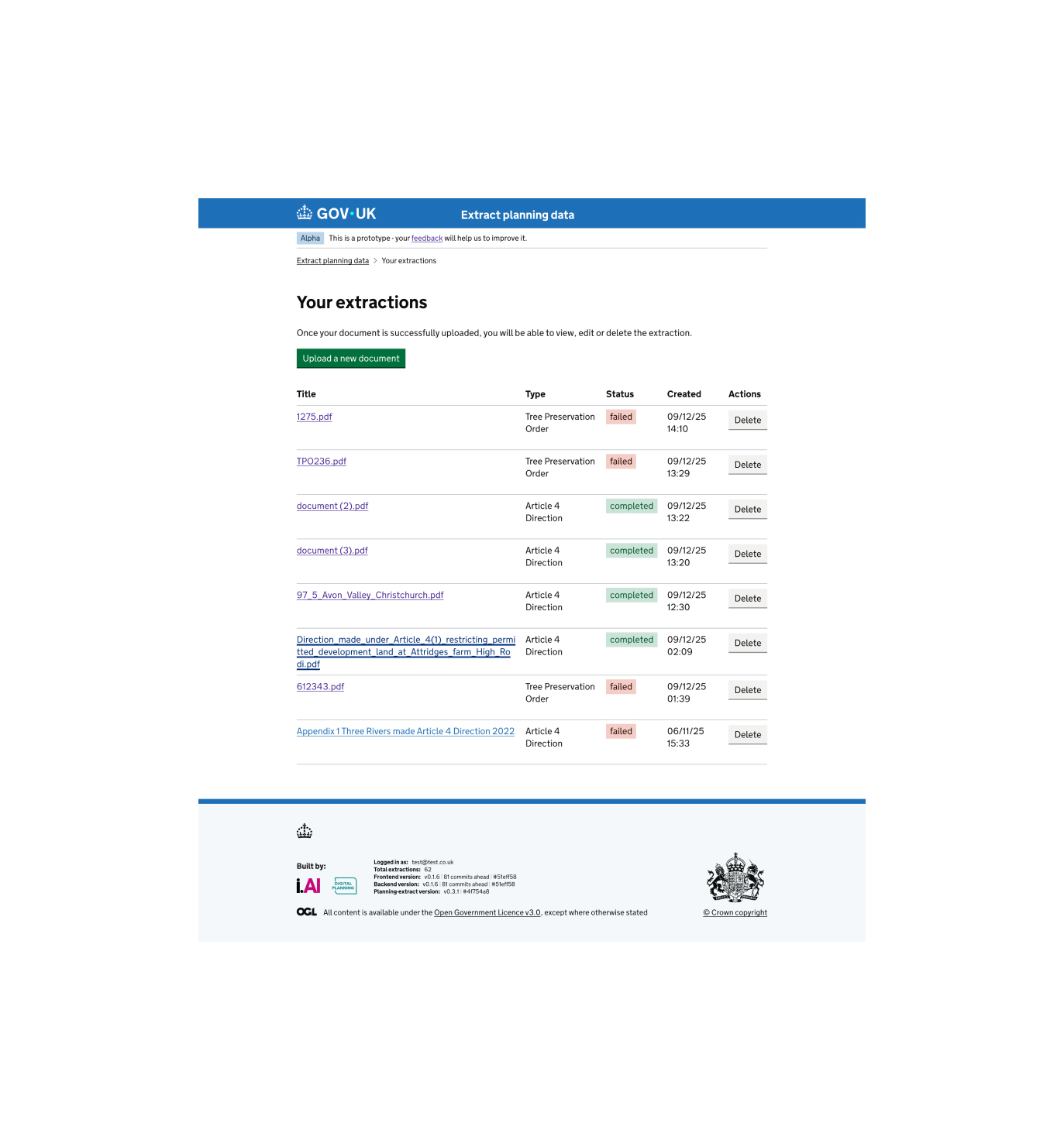
Users can now view historic Extractions and their status. This is a prepatory step, should we decide to add a bulk upload feature in future iterations.
Fig 4. Showing a user their extraction history
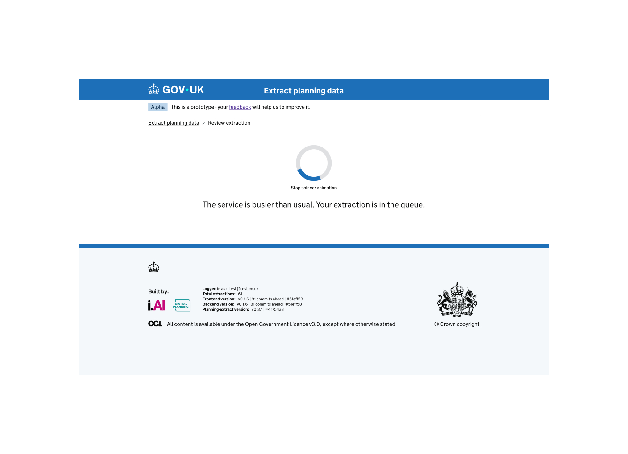
One of many accesibility tweaks: the loading spinner animation now has a ‘pause’ button. Other accessibility improvements include clearer drag and drop designs for uploading a document and informative content when a user enters the journey.
Fig 5. An improved loading page
As well as editing fields, a user can now edit any extracted area or points. Map tools like snapping and satellite imagery have been added by combining the front-ends.
We will look closely at how the user responds to this design before making any changes. Theres a lot to fit in here - editing the shape, editing how the map appears, showing the reference pdf. This will be a fun redesign when we get some insights.
Fig 6. Editing shapes